Rapid Re-launch: say hello to our exciting new brand!
Rapid Global
August 12, 2019

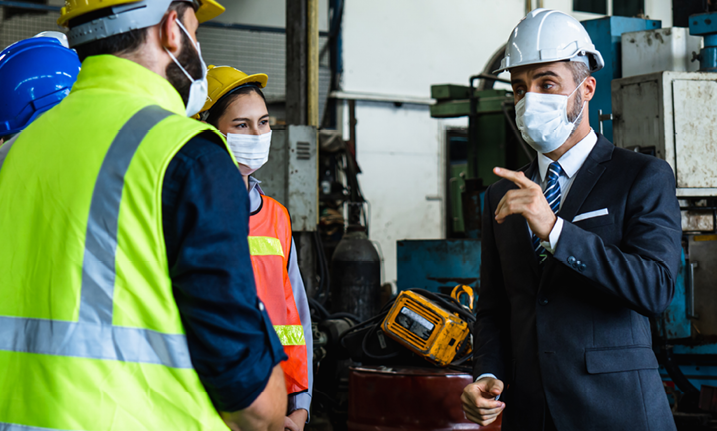
Rapid Global is one of the world’s expert voices in outsourced workforce compliance and management solutions. Today our products are used in over 650 organisations, including more than 100 blue chip companies, who are looking to optimise their workforce compliance processes. We currently have more than 60,000 contractor companies, 100,000 administrators, and 3,000,000 workers in our system.
While we have gained a strong reputation as a market leader, we felt our brand image was starting to look a little tired. So we have adapted our brand image to match how others see us!
As we continue to grow, expand our areas of focus, and update core product experiences, we want our brand to reflect best why we exist, what we believe in, and where we’re headed.
So, it’s time for a change!
It is not easy to build a new brand. We spent many hours brainstorming and trying to come up with the answers to why we exist, what we believe in, and where we’re headed.
To start with, our team brainstormed why our customers use Rapid Global and how it makes them feel.

So what did this look like?
Well to us, we agreed that having a brand that is flexible and adaptable, as well as vibrant and always innovating, is really important because these are the traits of technology. Plus, we wanted a brand that takes a friendly approach. We know the people reading this are just as human as we are, so we want our voice to be less formal and more relatable! This means that we needed to try to speak the customer’s language and make a bigger effort to understand their challenges.
We wanted to use modern illustrations as they are a way of visually showcasing the solutions we offer to our customers’ challenges. These images needed to be simple rather than complex, while still having meaning through the representation of the core product ability. They had to help the viewer understand that Rapid products are like a family. However, it was also important that our products each have a unique identity, while still remaining true to their colour code and broader Rapid family.
Then, we surveyed our staff and concluded that the words that we want to represent our brand are confidence, visibility, control, movement and progression.
We needed to develop a brand identity that could take us into the future, reflecting our hard-earned reputation as the leading provider of workforce compliance software. To begin shaping our new identity, ‘simplicity’ was the main keyword for what we were trying to achieve.
Our brand emerged based on the things our team and customers identified as ‘uniquely us’ or meaningful to Rapid throughout the rebranding process.
For starters, we’ve made the decision to drop the word ‘Global’ in keeping with our new brand’s feel, although we will still legally be known as Rapid Global. We noticed people refer to us as Rapid anyway!
As part of the outcome, we got creative with brainstorming what our new logo might look like. We unanimously agreed that it was important that whatever we developed paid respect to our old logo by keeping the arrow shape, but that it also demonstrated movement and progression. And this is the result!

We feel that the rounded edges of the icon and font show friendliness and flexibility, just like we aim to give our customers. But there are sharp edges included too: these display professionalism and trust, two more traits we do our best to show. You’ll notice there’s also a subtle tick in the middle of the logo, which we believe will deliver the message that we are proactive and stay positive.
While moving forward with our overall brand, we gave each of our product logos a facelift too! Although they all have their own unique look and feel, it’s just like family: they may have mum’s eyes and dad’s nose, but they still reflect individuality on their own.
We also updated some of our product names: Rapid Access System was shortened to Rapid Access, Rapid Visitor was merged into Rapid Access, and Rapid Service Alert is now called Rapid Auditor.
So what do the new logo icons represent?

Do you see a wheel or a clock? Both relate to managing contractors

The tick is emphasised here, representing course completion

You’ll see a key straight away – it’s obvious what this is for!

The symbol points to a specific thing, like a job task

Did you notice the flag? Bring attention to that incident!

Like ticking things off a checklist!
We took a bold step forward and developed a brand identity to take us into the future, reflecting our hard-earned reputation as the leading provider of workforce compliance software. From here, we want to continue working closely with our customers and listening to their suggestions. After all, who better to help us continue to innovate and improve our systems than those who use them the most!
Our plan is to offer even more support to all our audiences by improving our online presence and continuing to upskill our dedicated phone and email support team.
The new brand will take us confidently forward as we move into the international arena while building on the strength of our existing brand in the Australian market.
We are proud of our new look and feel, and can’t wait to take you on this journey into the future with us!
Subscribe to the monthly newsletter to receive the latest work health and safety information straight to your inbox.